Cart Impact Widget
The Cart Impact Widget is an app embed that automatically appears on your cart page, showing customers the environmental impact their order will make.
How it works
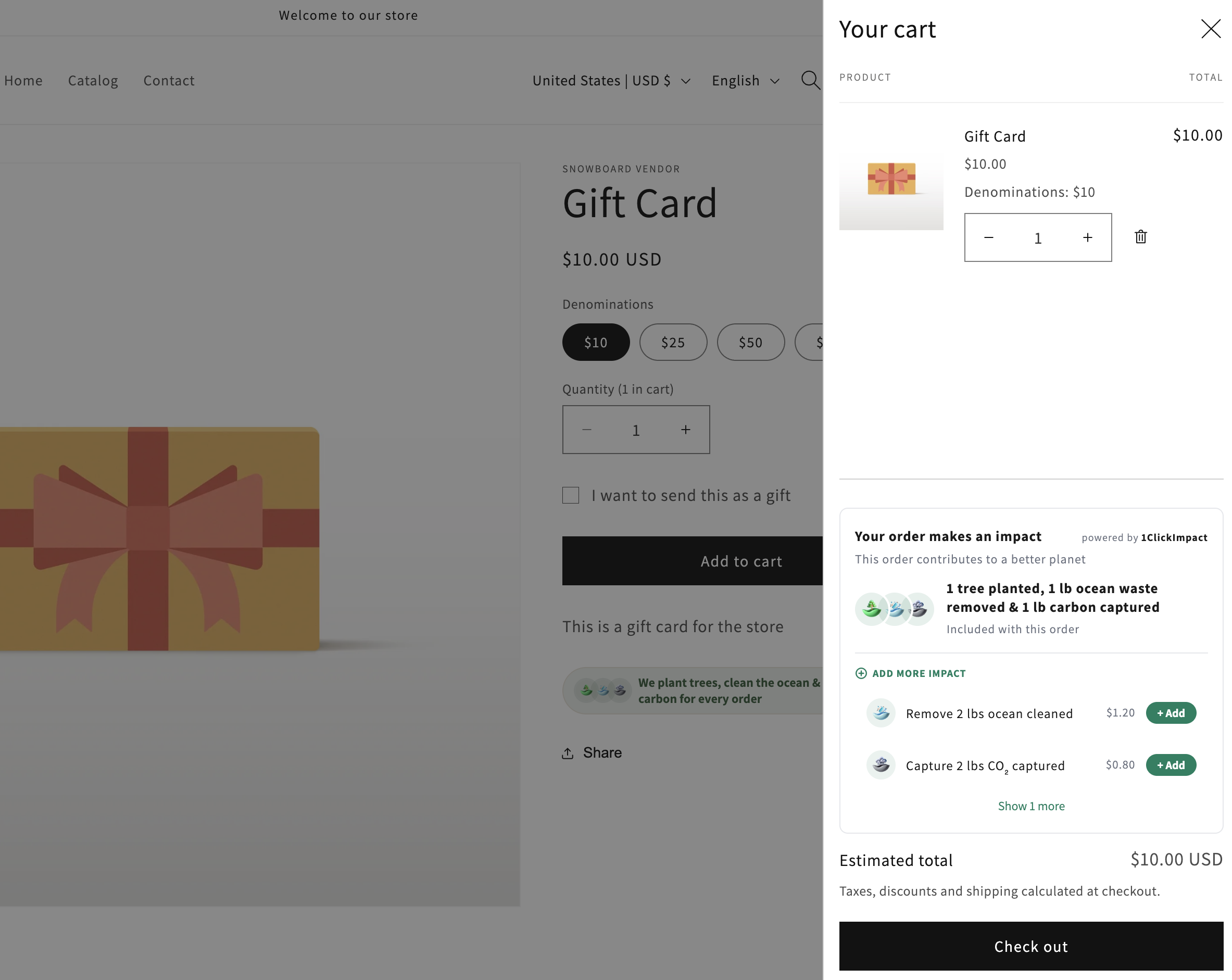
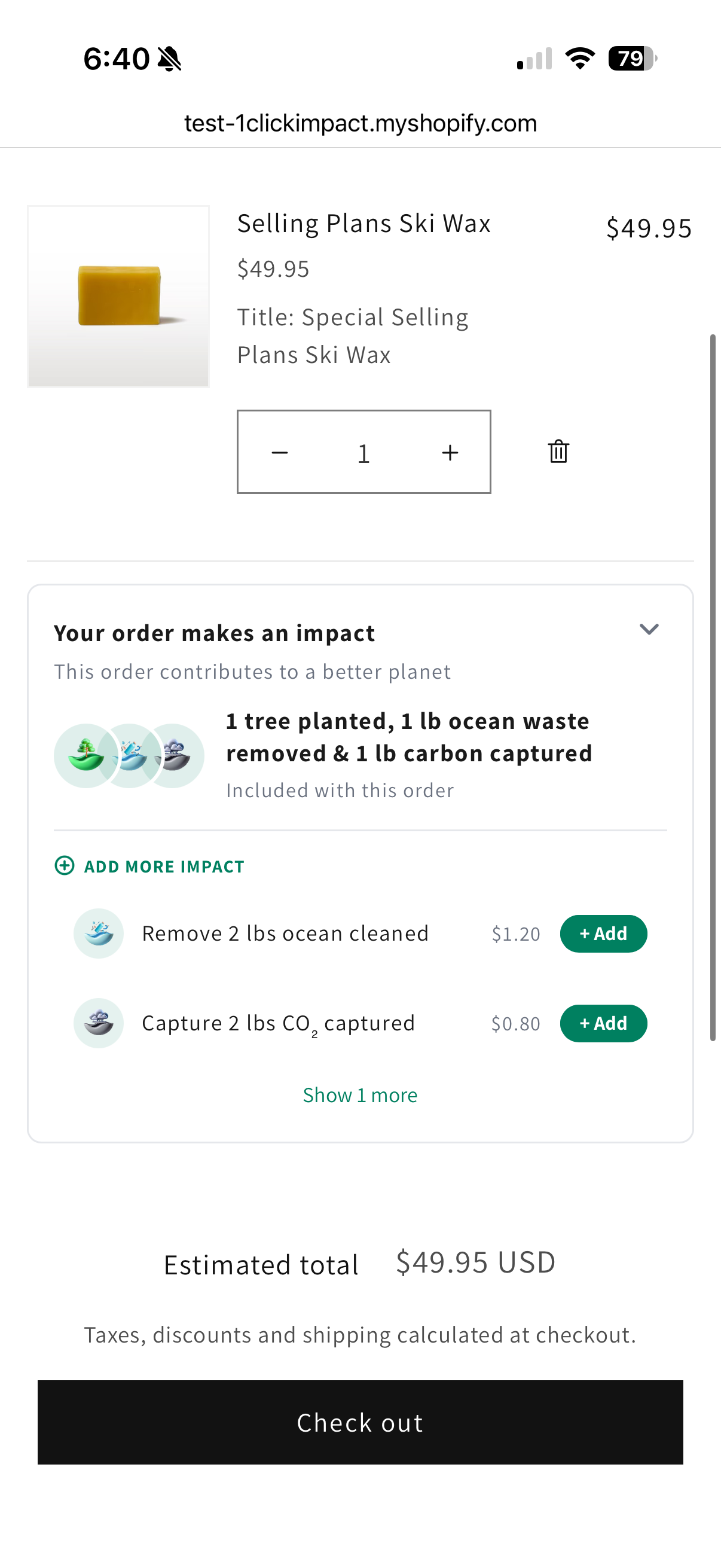
The Cart Impact Widget displays impact information directly on your cart page. Depending on your trigger mode, it can show:
- Per-order impact — The fixed impact that every order generates
- Per-product impact — Impact calculated based on the specific products in the cart
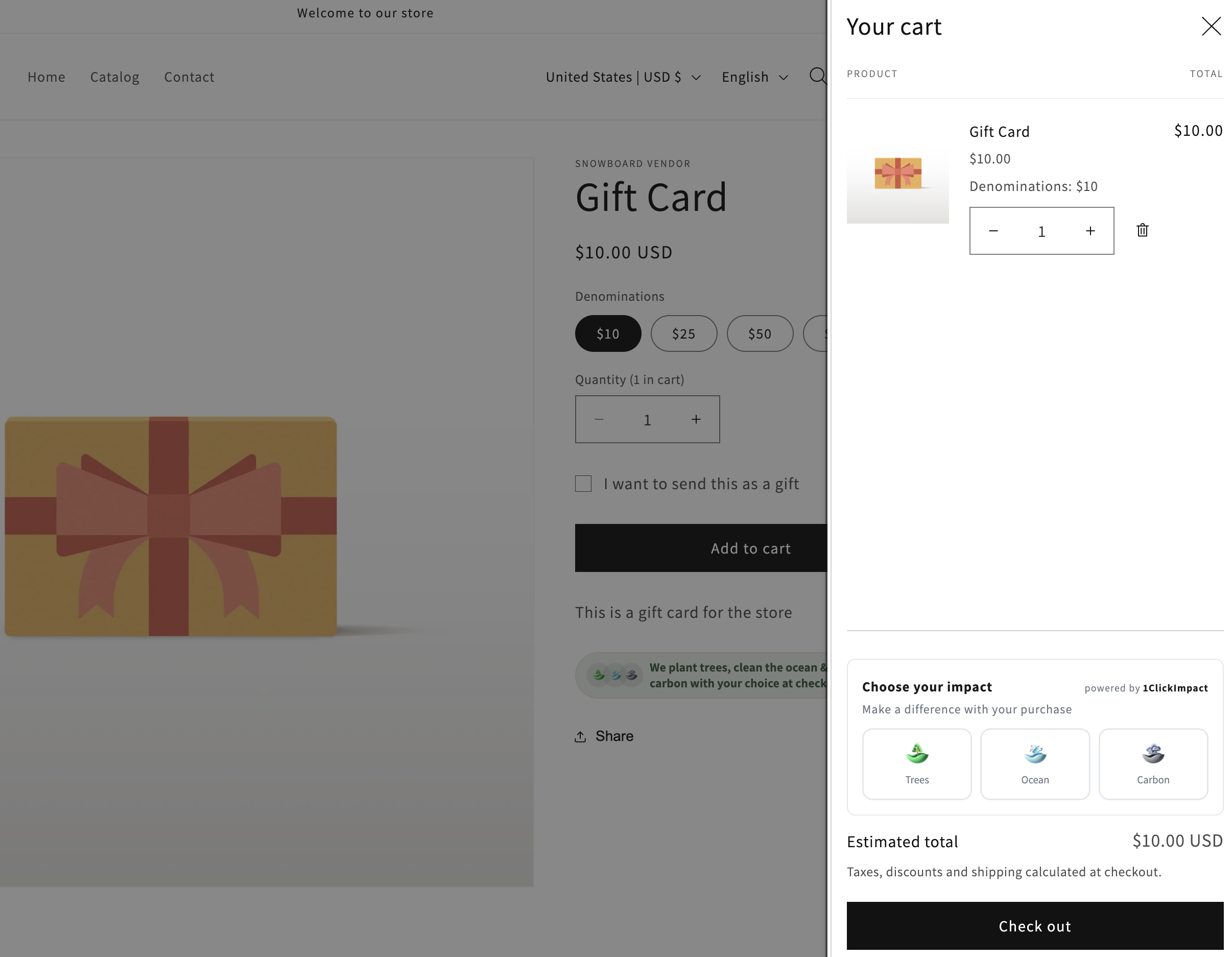
- Customer choice tiles — Interactive tiles that let customers choose which impact categories to support
- Add-on products — Optional impact add-ons that customers can include with their order
The widget updates automatically as customers add or remove items from their cart.
Installation
The Cart Impact Widget is installed as a Shopify app embed, which means it activates across your entire store without needing to edit individual templates.
- Go to your Shopify admin
- Navigate to Online Store → Themes → Customize
- Open the App embeds panel (toggle icon in the left sidebar)
- Find 1ClickImpact Cart Widget and toggle it on
- Click Save
The widget will automatically detect whether your store uses a cart page (/cart) or a cart drawer (AJAX slide-out panel) and render in the appropriate location.
If the widget does not appear
In most themes, the widget auto-detects your cart container and injects itself. If it does not show up on your cart page, you can manually place it by adding a placeholder element to your cart template:
<div id="oci-cart-widget-placeholder"></div>
Add this snippet wherever you want the widget to appear inside your cart template file (typically cart.liquid, cart-template.liquid, or a cart section file).
The widget will not render inside the Shopify theme editor preview. To verify it is working, visit your actual store URL with items in the cart.
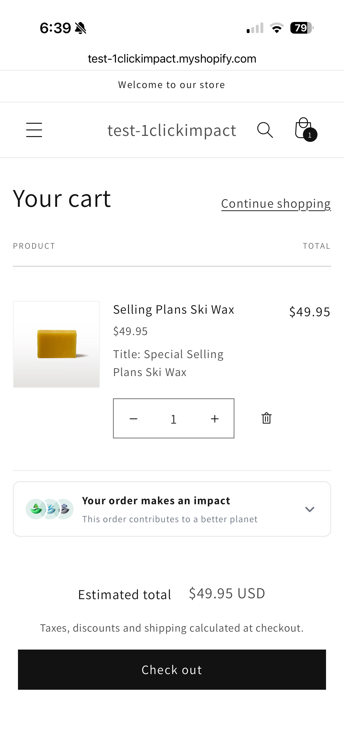
Mobile responsiveness
The widget is fully responsive. On smaller screens, the impact tiles collapse into a compact accordion-style layout that customers can expand to view details. This keeps the cart page clean on mobile devices while still presenting impact information.
Customization options
You can configure the widget appearance in the theme editor under the app embed settings:
- Title — Change the heading text displayed above the widget
- Subtitle — Add a secondary line of text below the title
- Primary color — Controls the accent color for tiles and interactive elements
- Background color — Sets the widget container background
- Icon size — Adjust the size of impact category icons
- Border color — Change the border around the widget container
- Show branding — Toggle the 1ClickImpact branding link on or off
Color changes take effect immediately in the theme editor preview, but you must click Save for them to appear on your live store.
Avatar tooltips
Each impact category in the widget is represented by an avatar icon. When a customer hovers over an icon on desktop (or taps on mobile), a tooltip appears with details about the impact type — such as "Real trees planted - tracked with certificate" or "CO₂ removed from air - verified by partners." This gives customers context without cluttering the widget layout.
Customer choice mode
When your store is configured for customer choice, the widget displays interactive toggle tiles for each impact category. Customers tap a tile to select or deselect it. The selected impacts are attached to the order at checkout.
If no selection is made, the default impact configuration you set in the app is used.
Add-on products
If you have add-on impact products enabled, they appear as optional items within the cart widget. Customers can add extra trees, ocean cleanup, or carbon capture on top of the base order impact. These are added as line items in the cart.