

Impact Details
The Impact Details block is a card-style widget for product pages that shows each impact category as individual chips with their quantities.
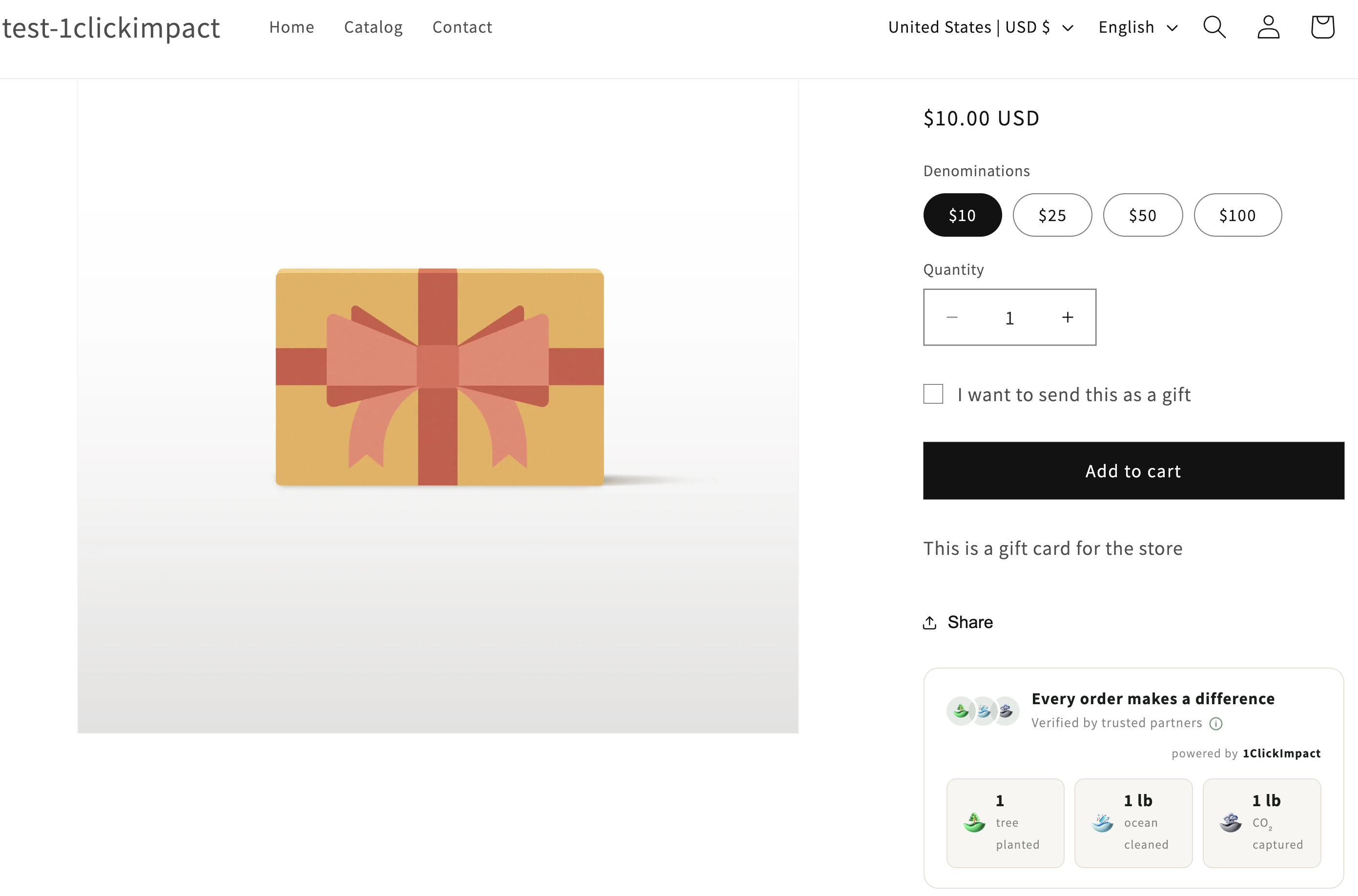
What it displays
The Impact Details block presents your impact configuration in a visual card format. Each enabled impact category appears as a chip showing:
- The impact icon (tree, ocean, carbon, or donation)
- The category name
- The quantity per trigger (e.g., "2 trees", "1 lb plastic")
Customers can click on the card to open a popup with full details, identical to the popup shown by the Product Badge widget.
Layout behavior
The Impact Details block adapts to the available width of its container. On wider layouts, chips are arranged in a horizontal row. On narrower containers or mobile screens, chips stack vertically or wrap to multiple rows. This makes it work well in both full-width and sidebar positions.
Installation
- Go to your Shopify admin
- Navigate to Online Store → Themes → Customize
- Open a product page template
- Click Add block or Add section and search for 1ClickImpact Impact Details
- Position the block where you want it on the page
- Click Save
You can use the Impact Details block alongside or instead of the Product Badge. They serve similar purposes but with different visual presentations. Choose the one that fits your product page layout best.
Customization options
The following settings are available in the theme editor:
- Primary color — Controls the chip accent color and icon tints
- Background color — Sets the card background
- Text color — Sets the text color for category names and quantities
- Border radius — Adjust the corner rounding of the card container
- Show branding — Toggle the 1ClickImpact branding link on or off
Popup details
The popup triggered from the Impact Details block is the same full-detail popup used by the Product Badge. It includes project photos in a carousel, impact breakdowns, and certificate information. See the Product Badge article for more details on the popup content.
Impact quantities shown in the chips reflect your current app configuration. If you change your impact settings in the app, the displayed quantities update automatically.